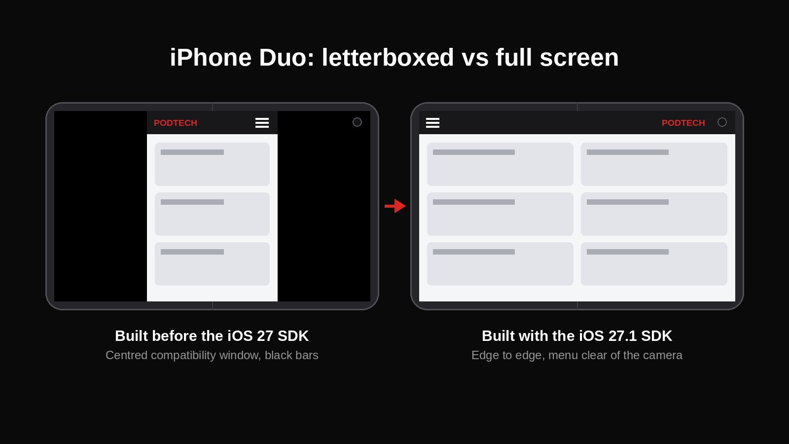
Apple's first foldable, the iPhone Duo, has a small outer screen and a large inner screen. Open an older app on the inner screen and it sits in a phone-sized box in the middle, with black bars around it.
PODTECH hit exactly this with three of its own apps. Getting them to use the full screen took changes at three levels: the build toolchain, the app shell, and the web app inside it. All three apps now fill both screens.
Why apps are boxed in
iOS decides this from the SDK an app was built with. Any app built before the iOS 27 SDK runs in a centred compatibility window on the inner screen.
The usual settings have no effect. Orientation, tablet support and "requires full screen" don't change it. The orientation fix is what sorts out Android foldables, so it's the obvious first thing to try, and the app still sits in the centre.
The iOS 27 SDK extends the app past the status bar, and the iOS 27.1 SDK takes it to the screen edges.
Rebuilding on the new toolchain
The fix starts with moving iOS builds onto Xcode 27.1, which ships the iOS 27.1 SDK.
That alone made the app crash on launch. Apps built with the iOS 27 SDK have to use Apple's newer "scene" lifecycle for managing windows, and Expo SDK 54 still used the old one.
Upgrading to Expo SDK 58 (React Native 0.88) solved it, because it uses the scene lifecycle by default. There was knock-on work:
- Firebase push notifications needed a major upgrade to v27, a switch to its new API, and a change in how its libraries are linked into the app. Left alone, the old code would have switched push off without any error.
- Xcode 27 rejects third-party libraries that still target very old iOS versions, so their minimum target went up to 15.1.
The minimum supported iOS version for the apps is now 16.4.
Android foldables, fixed alongside
Android letterboxes portrait-locked apps on an unfolded foldable. Removing the portrait lock and marking the app as resizeable fixes that.
Android also has to be told not to restart the app when the user folds or unfolds. Without that, every fold reloads the page and can lose the user's session.
Designing around the camera
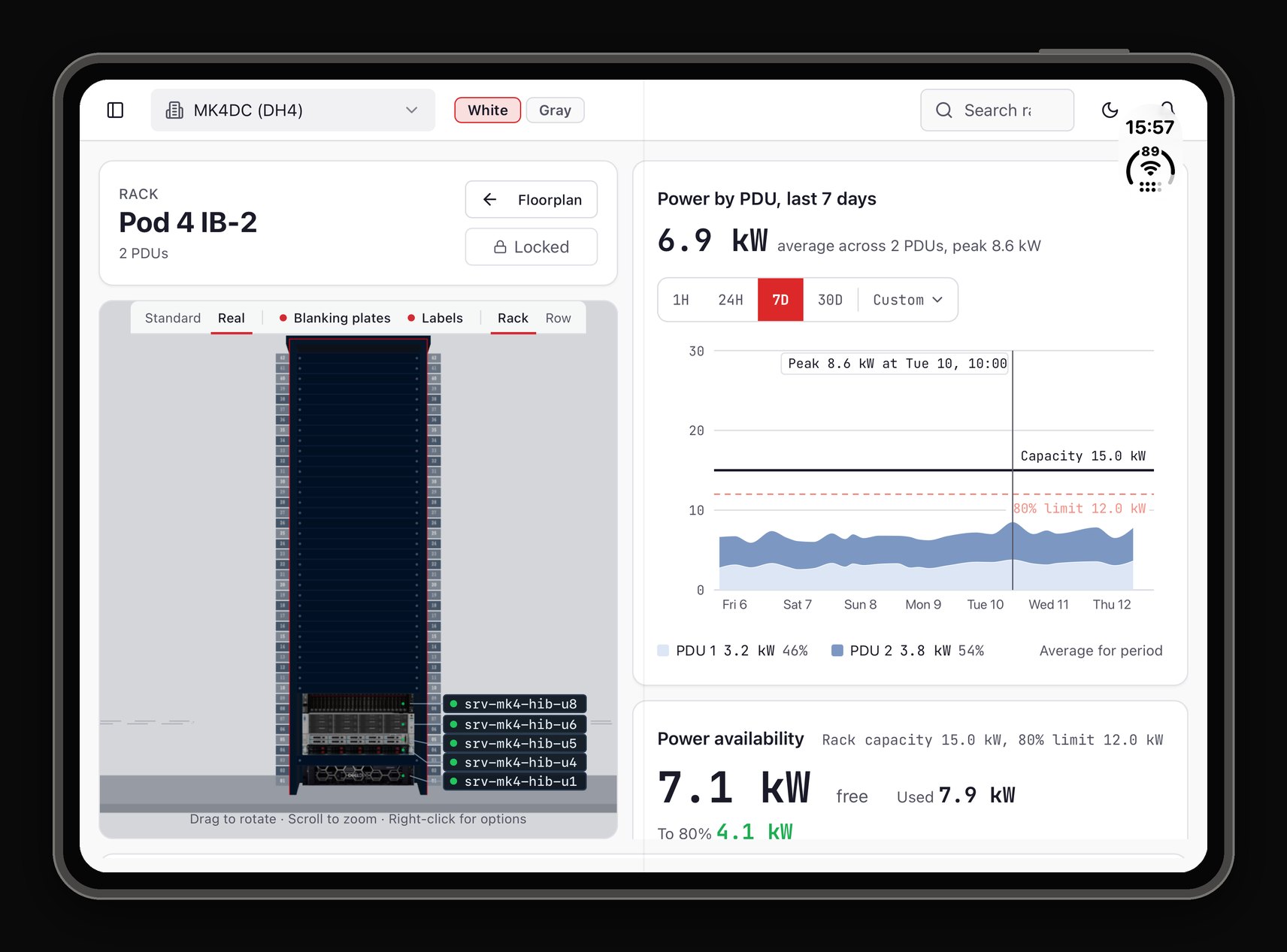
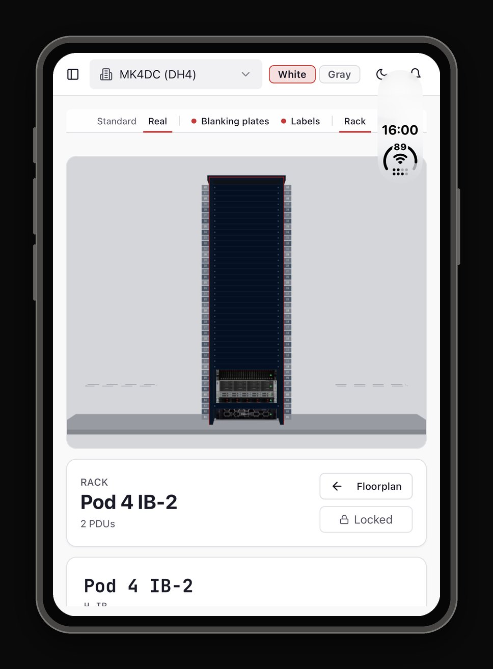
Folded, and unfolded in landscape (the default way to hold it), the front camera sits over the top-right corner of the header. That's where the menu button used to be.
In those postures the web app now puts the menu button on the far left and the logo on the far right. Unfolded portrait, other phones, tablets and desktop are unchanged. The layout updates the moment the user folds, unfolds or rotates the device.
The numbers
These were measured on a real Duo on 11 and 12 November 2026, in CSS pixels.
| Posture | Size |
|---|---|
| Folded, in Safari | Screen 386 wide. No other iPhone is 386. |
| Folded, inside the app | Web view 466 × 678 |
| Unfolded, landscape | Viewport 871 × 525 |
| Unfolded, portrait | About 669 wide |
For comparison, regular iPhones are 375 or 390 to 440 wide, and iPads start at 744.
Gotchas worth knowing
- Changing app settings doesn't fix the letterboxing. Only the SDK the app is built with does.
- The new SDK forces the scene lifecycle on you. Without it, the app crashes the moment it opens.
- Inside an app, the screen size the web page sees can be stale. WebKit stores the size when the page starts, so after unfolding it can still report the folded size. Check the visible area of the page as well.
- The same phone reports different sizes in Safari (386) and in an app (466), so test in both.
- Test every posture on a real device: folded, unfolded portrait and unfolded landscape.
Need your app ready for foldables?
PODTECH builds and maintains iOS and Android apps, including the toolchain upgrades that new devices demand.